Encyclopedia
Paint undertones explained: why your white looks pink, yellow or grey
This page is only available in English. The language switch leads to the closest German page.
In short
An undertone is the subtle second colour inside a paint, such as yellow, pink, green or blue in a white, beige or grey. It is hard to see on a small chip but obvious on four walls. Compare a sample against pure white paper and against the colours already in the room, and look at it in your own light at different times of day before you decide.
Contents
You choose a soft, warm white from a chip. On the wall it turns faintly pink. Or a calm grey turns out green in the afternoon. That second colour was there all along: it is the paint's undertone.
What an undertone is
Most paint colours are mixes. A white, beige or grey is rarely neutral; it carries a small amount of another colour that tips it warm or cool. That small amount is the undertone [1]. On a tiny chip held in a shop, you barely notice it. On four walls and a ceiling, lit by your windows and reflected back from the floor and furniture, it becomes the first thing you see.
Common examples:
- Whites: yellow or cream (warm), pink (warm), blue, grey or green (cool) [2].
- Beiges and greiges: pink, yellow, green or grey.
- Greys: blue (cool), green, purple, or warm brown.
How to see an undertone
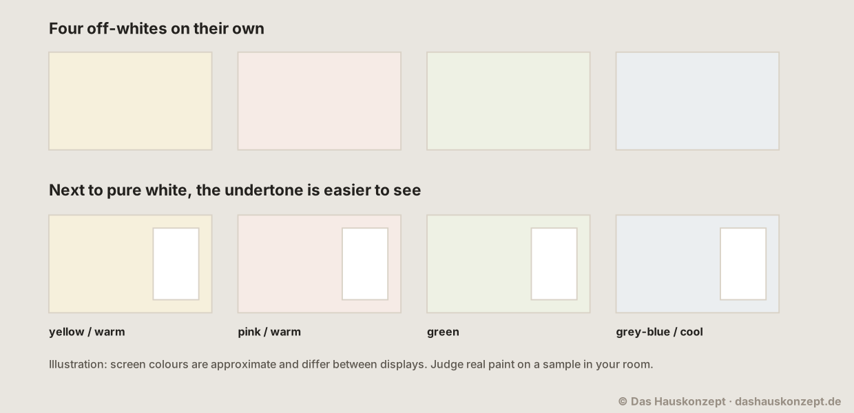 (Open the diagram full size)
- Compare against pure white. Hold the sample next to a sheet of plain white printer paper. The undertone appears in the difference [1].
- Compare against the paint's neighbours. Put two or three similar colours side by side. A beige that looks neutral alone may look pink next to another beige [2].
- Compare against what stays in the room: the floor, the sofa, the kitchen fronts. An undertone that clashes with a fixed material is the one to avoid [2].
- Go big. A sample at least the size of a sheet of paper, ideally larger, shows more than a chip.
Screens cannot show true paint colour, and printed charts vary too [6]. Use them to shortlist, then test real paint.
Light direction
The same paint can look different on each wall of the same room:
- Light from a cool, northern sky is even but bluish; it pulls colours cooler and greyer, and can make cool greys look cold [3].
- Warm, direct sunlight pushes colours warmer; a yellow undertone can look much stronger at sunset [4].
- Lamps usually give warm light in the evening; a cool white that worked by day may look dull at night [5].
So look at your samples in the morning, at midday, in the evening and with your own lamps on, on the walls where the paint will actually go [4].
Pairing undertones
- Warm with warm: a cream wall with oak, brass and terracotta.
- Cool with cool: a blue-grey wall with white oak, chrome and blue textiles.
- Bridge with a neutral: if two fixed materials disagree, a colour with a gentle, balanced undertone can sit between them.
- Trim and ceiling: pure bright white trim next to a warm white wall makes the wall look yellower. Choosing trim with a related undertone keeps it calm.
The swatch-test checklist turns this into a step-by-step test you can do in an afternoon.
Sources and method
The draft was written with AI assistance. Numbers, standards and safety notes rest on the sources listed below; each source carries the date we last opened and checked it.
Editorially reviewed by Anna Muller on 11 October 2026 before publication.
- What's in a Color? Understanding Paint Undertones , Sherwin-Williams (Tinted blog). checked Supports: The undertone is a paint colour's underlying colour; putting a colour next to a pure white shows how it differs, and a green, pink or blue undertone shows up in that comparison.
- The Ultimate Guide to White & Off-White Paint Colors , Benjamin Moore. checked Supports: Warm whites have red, orange and yellow undertones and cool whites green, blue and violet; viewing whites next to one another makes the undertone more obvious, and samples should be viewed against your own furnishings.
- Best Paint Colors for North-Facing Rooms , Benjamin Moore. checked Supports: A north-facing room gets consistent, muted light with a cool cast.
- Best Paint Colors for West-Facing Rooms , Benjamin Moore. checked Supports: West-facing rooms get stronger direct light after noon with a warmer cast, and samples should be observed throughout the day and evening.
- How Light & Finish Affect Paint Color , Sherwin-Williams (Tinted blog). checked Supports: Incandescent bulbs give yellow light that intensifies warm colours and tends to dull cooler colours.
- The Color Handbook , Benjamin Moore. checked Supports: On-screen and printer colour representations may vary from actual paint colours.