Encyclopedia
Visual weight explained: why some furniture makes a small room feel crowded
This page is only available in English. The language switch leads to the closest German page.
In short
Visual weight is how heavy a piece of furniture looks, which is not the same as its size or actual weight. Pieces look heavier when they are closed down to the floor, dark, high-contrast against the wall, bulky in outline or densely filled. In a small room, keeping a few large pieces visually light, and grouping the heavy ones, makes the same floor area feel calmer.
Contents
Visual weight is a design term for how heavy something looks. It is not the same as kilograms or footprint [1]: a sofa and a bench with exactly the same length and depth can make a room feel crowded or calm, depending on how they are made. In a small room, where every piece is close to every other, visual weight matters more than in a large one.
This is a way of describing perception, not a measurement. It helps you compare options and explain why a room feels the way it does.
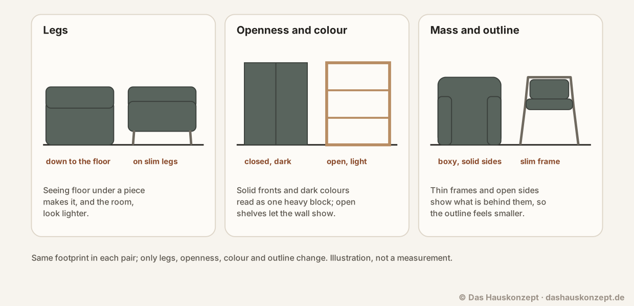 (Open the diagram full size)
The five factors
- Legs and floor. A piece that sits on legs shows the floor underneath it; one that is closed down to the floor hides it. Seeing more floor makes a room read as larger.
- Openness. Open shelves, frames and slatted sides let you see the wall or the room behind them. Solid fronts and sides read as one block.
- Colour and value. Dark pieces look heavier than light ones of the same size, especially against a light wall [2].
- Contrast. A piece that matches or is close to the wall colour recedes; one that contrasts strongly stands out and draws the eye, which adds weight [2].
- Outline and mass. Thick arms, deep cushions and rounded bulk look heavier than thin frames and straight, slim lines.
Texture and pattern add to this: a busy pattern or a heavy texture looks heavier than a plain, smooth surface [1] [2].
Same footprint, side by side
- A sofa with a skirt to the floor vs the same sofa on slim legs: same seat, same length; the one on legs lets the floor run underneath and looks smaller.
- A closed, dark cabinet vs an open, light shelf of the same size: the cabinet reads as a solid block; the shelf lets the wall show through.
- A boxy armchair vs one with a slim frame and open sides: similar seat, but the slim chair's outline takes up less of the view.
None of the heavier versions is wrong. A closed cabinet hides more, and a deep armchair may be more comfortable. Visual weight is one thing to weigh up, not the only one.
Using it in a small room
- Keep the largest pieces light where you can: a sofa on legs, a bed frame with space underneath, a light or open wardrobe front.
- Group heavy pieces along one wall rather than spreading them around the room, so the rest of the room stays open.
- Let one piece be heavy on purpose. A single dark or bold piece gives the room an anchor; several compete with each other.
- Match tall pieces to the wall. A tall cabinet in the wall colour reads as part of the wall rather than as furniture.
- Leave gaps. Half-filled open shelves and a bit of wall between pieces look lighter than every surface covered.
Where it does not help
Visual weight does not make a room physically bigger or a walkway wider. If a sofa blocks the way to the window, a lighter-looking sofa still blocks it. Check the walkways and door swings first, then use visual weight to choose between the pieces that fit.
Sources and method
The draft was written with AI assistance. Numbers, standards and safety notes rest on the sources listed below; each source carries the date we last opened and checked it.
Editorially reviewed by Anna Muller on 11 October 2026 before publication.
- Principles of Design (ART 2650 Introduction to Design Process and Programming) , Ohio University. checked Supports: In an interior you work with the visual weights of furnishings; visual weight does not necessarily relate to an object's physical size but to the attention it demands, and a busy or heavy texture holds more attention than a smooth plain surface.
- Design Principles: Visual Weight And Direction , Smashing Magazine. checked Supports: Dark elements have more visual weight than light ones, elements that contrast with their surroundings look heavier, and textured elements appear heavier than non-textured ones.