Guide · Checklist
Choosing a paint colour: a 7-step swatch test checklist
Applies to: USRentersOwners Sample sizes and coverage are Benjamin Moore's US products; other brands' samples differ in size and finish.
This page is only available in English. The language switch leads to the closest German page.
In short
Test a paint colour on large two-coat samples on two or more walls, viewed in morning, midday and evening light and under lamps, before you buy. One 8 oz (237 ml) Benjamin Moore sample covers about 2 × 2 ft (61 × 61 cm), enough for two 1 × 2 ft boards. Compare each dry sample with a pure white and with your floor and trim before you decide.
At a glance
| What | Value | Basis |
|---|---|---|
| Peel-and-stick sample sheet (Benjamin Moore) | 9 × 14.75 in22.9 × 37.5 cm; real paint on a reusable, movable sheet that can be cut to size | [8] |
| Painted pieces per colour | 2 or moreFarrow & Ball: two coats on thick paper or card, at least twice, the bigger the better | [1] |
| One 8 oz sample area in peel-and-stick sheets | ≈ 4.3 sheets2 × 2 ft = 576 sq in, divided by 132.75 sq in per 9 × 14.75 in sheet | calculated · [7] |
| Bulb colour scale on the ENERGY STAR chart | 2200–6500 KLower K is warmer and yellowish, higher K cooler and bluer; soft and warm white are called ideal for most indoor uses | [11] |
| Time to live with the samples | a few daysFarrow & Ball: check over a day or two; Benjamin Moore: live with your options for a few days before you buy | [3] |
Contents
- How do you test paint colours before painting?
- How big should a paint sample be?
- Peel-and-stick samples or brush-on paint: which should you use?
- Where should you put paint samples in a room?
- What time of day should you look at paint samples?
- How do you see a paint colour's undertone on a sample?
- How do you compare paint samples fairly?
- Can you test paint colours in a rental?
- Printable swatch test checklist
- Common questions
- Sources and method
A paint chip shows a colour small and under shop lighting; a wall shows it from floor to ceiling in your own light. This checklist closes that gap with real paint, large samples, written notes and a decision only after the samples have been lived with.
How do you test paint colours before painting?
Test paint colours by painting real samples large, placing them around the room and judging them dry, at several times of day, against the things that stay. Benjamin Moore suggests painting a board, foam core will do, moving it to different parts of the room and watching how the colour changes through the day [2]. Farrow & Ball's method is the same idea on thick paper or card: two coats, the bigger the better [1].
Shortlist your finalists
Narrow the choice with colour chips, which Sherwin-Williams offers as a free, fast way to compare colours, then test only the finalists in real paint. The swatch record has rows for three. If you are torn between two shades, add the next lighter or darker one from the same strip.[10]
Make large two-coat samples
Brush two coats of each colour onto foam board or thick card, the bigger the better, and let it dry; Farrow & Ball asks for at least two pieces per colour. One 8 oz Benjamin Moore sample covers about 2 × 2 ft (61 × 61 cm) in two coats. Peel-and-stick sheets skip the painting and the drying.[1]
Two 1 × 2 ft (30.5 × 61 cm) boards per 8 oz sample
Spread them around the room
Place the pieces in different parts of the room, at least one on the brightest wall and one on the darkest, and keep them apart rather than side by side. Move each board up to the ceiling line and next to the trim as well as holding it at eye level.[1]
Look at four times of day
Check each sample in the morning, at midday, in late afternoon or evening, and after dark with the curtains closed and the lamps on. Write down what you see each time in the swatch record, using the same words for every sample.[6]
4 checks per sample position
Check against what stays
Hold each sample against the floor, the trim, the doors, the sofa and the curtains. Benjamin Moore suggests comparing paint colours against your home furnishings; a colour that fights a fixed material will keep fighting it on four walls.[3]
Read the undertone
Put each sample next to a pure reference, a pure white for whites and off-whites, a pure example of the colour or a colour wheel for anything else. The colour it leans towards is its undertone; make sure it is the one you want.[4]
Live with the samples, then decide
Leave the samples up for a few days, as Benjamin Moore advises, and make the final call in the light you use the room in most. The sample that still looks right at every check in your record is the one to buy.[3]
Steps 1 to 3 are the set-up and take one session. Steps 4 to 7 are the judging, spread over several days, and they decide the result.
How big should a paint sample be?
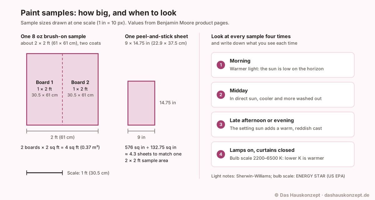
A paint sample should be as big as you can manage: Farrow & Ball says the bigger the better and asks for at least two painted pieces per colour [1]. As a practical yardstick, one 8 oz Benjamin Moore sample covers about 2 × 2 ft (61 × 61 cm) in two coats, the same number of coats the maker recommends for regular paint [7].
| Sample format | Size | What it gives you |
|---|---|---|
| Brush-on sample, 8 oz (237 ml) | About 2 × 2 ft (61 × 61 cm) in two coats [7] | Real tinted paint on a board or straight on the wall [7] |
| Two boards from one 8 oz sample | 1 × 2 ft (30.5 × 61 cm) each, 4 sq ft (0.37 m²) together | Two pieces per colour for two different walls [1] |
| Peel-and-stick sheet | 9 × 14.75 in (22.9 × 37.5 cm) [8] | Real paint on a ready-made sheet, about 23 % of the area of the two boards |
| Colour chip | Small | A free, fast way to compare colours [10]; too small to judge a wall |
 (Open the diagram full size)
The arithmetic matters when you shortlist several colours, because the number of samples to buy follows from the board size. With 1 × 2 ft boards, one 8 oz sample per colour paints Farrow & Ball's two pieces and uses roughly the whole sample.
If you want a bigger single sample, use the whole 2 × 2 ft area on one board and make the second piece a peel-and-stick sheet of the same colour.
Peel-and-stick samples or brush-on paint: which should you use?
Use brush-on samples when you can paint a board or a patch of wall, and peel-and-stick sheets when you cannot wait for paint to dry or cannot mark the wall. Benjamin Moore calls brushing on samples "always the best test", even for hallways, trim and doors, and also offers reusable peel-and-stick samples [3].
| Option | Strengths | Limits |
|---|---|---|
| Peel-and-stick sheet | Real paint; reusable and movable between walls and rooms; wraps around corners; can be cut to size [8]; no mess or dry time [10] | Fixed size of 9 × 14.75 in, and sold in a stated sheen (eggshell on the page opened), so check it against the paint you will buy [8] |
| Brush-on sample on a board | Real paint at any size up to about 2 × 2 ft per 8 oz; easy to move around the room [7] [9] | Needs two coats and drying time before you judge it [5] |
| Brush-on sample on the wall | Shows the colour in place, on the real wall surface [3] | Cannot be moved; marks the wall, so only where you will repaint |
| Colour chip | Free and quick for comparing colours side by side [10] | Too small for a decision; use it to shortlist |
A practical combination: chips to shortlist, one brush-on board per colour for the main wall, and a peel-and-stick sheet to carry into the darker corners.
Where should you put paint samples in a room?
Put paint samples in several parts of the room, spread apart, including on the brightest and the darkest wall. Farrow & Ball says to spread the sheets out so you see the colour in different surroundings, and not to put them directly next to each other "like a patchwork quilt" [1].
Which way a wall and its window face changes what you see. Benjamin Moore says direction "has a powerful effect on a paint color's intensity and cast": a north-facing room tends to get consistent but muted light and can be a bit darker than one with southern exposure [9]. Sherwin-Williams adds that a west-facing room can look dull and shadowy in the morning but be bathed in a warm glow in the evening [6]. A sample on the brightest and on the darkest wall shows both ends of that range in the same room.
Height and neighbours count as well. Move each board up to the ceiling line, down to the baseboard and next to the door and window trim, because Farrow & Ball's final check is how the colour works with your ceiling and trim [1].
What time of day should you look at paint samples?
Look at paint samples in the morning, at midday, in late afternoon or evening, and once with the lamps on, because the light in a room changes many times a day [2]. Sherwin-Williams describes the pattern that makes one colour look like several [6]:
| Check | What the light does | What to write down |
|---|---|---|
| Morning | Warmer, because the sun is lower on the horizon [6] | Does the colour turn warmer or yellower? |
| Midday | In rooms with direct sun, colours can look cooler and more washed out [6]; direct midday sun brightens any hue [2] | Does it fade, go chalky or vanish? |
| Late afternoon or evening | The setting sun brings a warm, reddish cast [6] | Does a grey or white drift pink or beige? |
| Lamps on, curtains closed | Artificial light adds a warm glow to wall colour [2]; Farrow & Ball's low-light check [1] | Is it still the colour you chose? |
Lamp light depends on the bulb. ENERGY STAR's buying guide says light colour matches a temperature on the Kelvin scale, with lower K warmer and yellowish and higher K cooler and bluer; its chart runs from 2200K to 6500K and calls soft white and warm white ideal for most indoor applications [11]. Sherwin-Williams notes that incandescent light intensifies warm colours and dulls cooler ones, while fluorescent light amplifies blues and greens and mutes warm colours [6]. Judge the evening check under the bulbs that will stay in the room; if you plan to change bulbs, change them before you test.
How do you see a paint colour's undertone on a sample?
You see a paint colour's undertone by putting the sample next to a pure reference. Sherwin-Williams says a white looks just white on its own, but next to a pure white its green, pink or blue undertone shows up; for other colours, a pure example of that colour or a colour wheel does the same job [4].
A sheet of bright white paper held beside each sample is a handy pure-white reference. The sample's own colour strip helps too: Sherwin-Williams says the undertone is much easier to identify in the mid-to-darker colours on a strip than in the paler colours at the top [4].
The undertone then has to suit what stays in the room. Benjamin Moore describes warm whites as having undertones of red, orange and yellow and cool whites as having hints of green, blue and violet, and says red, yellow and neutral accessories harmonise with warmer whites while green, blue and cool grey furnishings suit cooler ones [3]. Hold the sample against the sofa, the floor and the curtains and ask which way they lean. Lighting brings undertones out [4], so repeat the check at each time of day rather than once.
How do you compare paint samples fairly?
Compare paint samples fairly by recording the same observations for each one, on the same walls at the same times, and only once the paint is dry. Sherwin-Williams says wet paint is a slightly different colour than dry paint [5], and that the finish can drastically affect how a colour looks, with higher-gloss paints tending to enrich and brighten colour [6].
Benjamin Moore's 8 oz brush-on samples come in eggshell [7]. If the wall paint will be flat or satin, keep the difference in mind when you judge, and compare samples in the same finish with each other rather than with one in another sheen.
Print the record below with the checklist. Fill in one row per sample position at each look, using short words such as "warm", "grey", "pink" or "flat", so you compare notes rather than memories.
| Colour | Wall | Morning | Midday | Evening | With lamps | Against floor and trim | Undertone |
|---|---|---|---|---|---|---|---|
| A | bright | ||||||
| A | dark | ||||||
| B | bright | ||||||
| B | dark | ||||||
| C | bright | ||||||
| C | dark |
Whites need the most patience: Benjamin Moore says white paint colours are especially prone to taking on different tonalities from morning to evening [3].
Can you test paint colours in a rental?
You can test paint colours in a rental with movable samples, peel-and-stick sheets or painted boards, and paint on the wall only if your lease allows it. Benjamin Moore describes its peel-and-stick sheets as having a non-damaging adhesive backing and being movable to test on different walls and in different rooms [8], and suggests painting a foam poster board so you can move it around easily [9].
A painted board held up with removable putty or leaned on the baseboard does the same job as a patch on the wall. If you do want to paint straight onto a rented wall, read what your lease says about painting first, and keep the patch where the whole wall will be repainted in the colour you choose.
Printable swatch test checklist
The printable swatch test checklist below repeats the test as tick boxes: work through it before you buy paint, and keep it with the swatch record.
Before you start
Making the samples
Viewing
Deciding
Common questions
Can I choose a paint colour from a screen or a printed chart?
Only as a shortlist. Benjamin Moore warns that on-screen and printer colour representations may vary from actual paint colours, and recommends buying a sample to see the colour in real time from morning to night. Use a screen or chart to narrow the field, then test real paint in the room.[2]
Are paint sample pots the same as the paint I will buy?
Not exactly. Benjamin Moore says its 8 oz samples are intended for paint colour representation only and come in an eggshell finish, which it calls best for testing colour. Two coats are recommended, as with regular paint. Use the sample to choose the colour, then buy the product and sheen the wall needs.[7]
Do paint colours look different in winter and summer?
Yes. Benjamin Moore says winter light tends to be cooler and sharper than summer light, and that summer light can give the same paint colour a warmer cast. If you test in one season, look at the samples on a bright day and a dull one, and expect the colour to read a little differently in the other season.[9]
Why does paint look darker on the ceiling?
Mostly because of where the light comes from. Sherwin-Williams says in-ceiling light fixtures make the paint on the top edges of walls and on the ceiling itself appear dark in comparison. If the ceiling will be painted in colour too, hold a sample board flat against the ceiling at every check.[6]
Can I use paint samples to choose an exterior colour?
Yes, for colour only. Benjamin Moore says its 8 oz brush-on samples can be used to evaluate exterior colour but are not meant to withstand sun and weather. Judge outdoor samples soon after they dry, in daylight at different times of day.[7]
Sources and method
How this article was made: Opened and read on 2026-10-14: Farrow & Ball's sampling guide; Benjamin Moore's Color Handbook, white-paint guide, north-facing-room guide and the product pages for its 8 oz paint sample and its peel-and-stick sample; Sherwin-Williams pages on undertones, light and finish, painting mistakes and sample options; and the ENERGY STAR (US EPA) light bulb purchasing guide. No calculator was needed; the sample arithmetic is shown on the page. No paint or sample was tested for this article.
What this article adds: Turns the makers' sample sizes into a to-scale diagram and a worked example (one 8 oz sample makes two 1 × 2 ft boards, about 4.3 peel-and-stick sheets of area), with a four-look viewing schedule and a printable swatch record.
Use of AI: Revised with AI assistance; every source was opened and checked on 2026-10-14; editorially reviewed before publication.
Editorially reviewed by Anna Muller on 11 October 2026 before publication.
- How To Sample Paint Colours , Farrow & Ball. checked Supports: Apply two coats of your sample onto thick paper or card, the bigger the better, and let it dry; ideally do this at least twice so you have multiple pieces; place the sheets around the space, spread out in different areas, and don't put them directly next to each other like a patchwork quilt; check them over a day or two in different lights; close the curtains and turn on a lamp to see the colours in low light; ask how the colour works with your ceiling and trim.
- The Color Handbook , Benjamin Moore. checked Supports: Paint a board (foam core will do) and move it around to different parts of the room; monitor how the paint colour changes at different times of the day; light in a room changes many times throughout the day; direct midday sun will brighten up any hue; artificial light adds a warm glow to wall colour; on-screen and printer colour representations may vary from actual paint colours; buy a paint sample to experience paint colour in real time, from morning to night.
- The Ultimate Guide to White & Off-White Paint Colors , Benjamin Moore. checked Supports: Use brush-on paint samples or reusable peel & stick samples and live with your options for a few days before you buy; brushing on samples, even for hallways, trim and doors, is always the best test; test from morning to evening under natural and artificial light; whites are especially prone to different tonalities from morning to evening; view the colours against your home furnishings; warm whites have undertones of red, orange and yellow, cool whites hints of green, blue and violet; red, yellow and neutral accessories harmonize with warmer whites, green, blue and cool gray furnishings with cooler whites.
- What's in a Color? Understanding Paint Undertones , Sherwin-Williams (Tinted blog). checked Supports: Don't look at colors on their own: a white looks white by itself, but put it next to a pure white and the green, pink or blue undertone shows up; for any color, put it next to a pure example of that color, or use a color wheel, and the undertone reveals itself; holding chips next to each other helps spot the difference; the undertone is much easier to identify in the mid-to-darker colors of a color strip than in the paler colors at the top; natural or artificial lighting brings out undertones.
- How to Avoid Common Painting Mistakes , Sherwin-Williams. checked Supports: Wet paint is a slightly different color than dry paint; wait until all blotches are gone and the color is uniform.
- How Light & Finish Affect Paint Color , Sherwin-Williams (Tinted blog). checked Supports: Morning light is warmer because the sun is lower on the horizon; at midday, especially in rooms with direct sunlight, colors can appear cooler and more washed out; late-afternoon light from the setting sun brings a warm, reddish cast; a west-facing room can look dull and shadowy in the morning but be bathed in a warm glow in the evening; incandescent light intensifies warm colors and dulls cooler ones; fluorescent light amplifies blues and greens and mutes warmer colors; finish can drastically affect how a color looks; higher gloss paints tend to enrich and brighten color; in-ceiling lights make paint on the top edges of walls and on ceilings appear dark in comparison.
- Paint Color Samples - 8 oz. (product page) , Benjamin Moore. checked Supports: 8 oz (1 half pint) sample; covers approximately 2 ft x 2 ft, two-coat area; two coats recommended (same as regular paint); eggshell finish, best for testing color; intended for paint color representation only; ideal for interior use, can be used to evaluate exterior color but not meant to withstand sun/weather; brush on wall or foam board; test how color changes in different light, in different spaces.
- Peel and Stick Paint Sample (product page) , Benjamin Moore. checked Supports: Large size 9 in x 14.75 in; made using real paint, painted with actual Benjamin Moore paint; reusable and movable to test on different walls and in a variety of rooms; wraps around corners; non-damaging adhesive backing; can be cut to size as needed; recommended for interior use.
- Best Paint Colors for North-Facing Rooms , Benjamin Moore. checked Supports: Direction has a powerful effect on a paint color's intensity and cast; a north-facing room tends to get consistent light throughout the day, can be a bit darker than rooms with southern exposure and its light can be muted; winter light tends to be cooler and sharper than summer light, and summer lighting can give the same paint color a warmer cast; check colors under your home's lighting throughout the day and evening, in artificial and natural light; paint a foam poster board so you can easily move it around.
- Try Before You Buy: paint color samples , Sherwin-Williams. checked Supports: Three sampling options: Color Chips, a free, fast and easy way to compare colors; Peel & Stick, to test popular shades in different spaces with no mess or dry time; Color To Go paint samples, to brush on real paint with a tinted sample.
- Light Bulb Purchasing Guide: LED Bulbs Made Easy (March 2020) , ENERGY STAR (U.S. Environmental Protection Agency). checked Supports: Light color, or appearance, matches a temperature on the Kelvin scale (K); lower K means warmer, yellowish light, higher K cooler, bluer light; the chart runs from 2200K to 6500K: soft white and warm white are ideal for most indoor applications, neutral and cool white good for kitchens and work spaces, daylight good for reading.